Back to the Source
A brand identity for a family-led organic produce business built around reconnecting people with where their food comes from.
Services:
Brand Identity, Packaging, Logo Design, Copywriting
Industry:
Organic Produce
Timeline
7 Weeks
The Challenge
Organic produce is an easy category to blend into. Green palettes, leaves, handwritten type and words like fresh, natural and sustainable have become almost interchangeable.
But this business had something most of those brands could not claim.
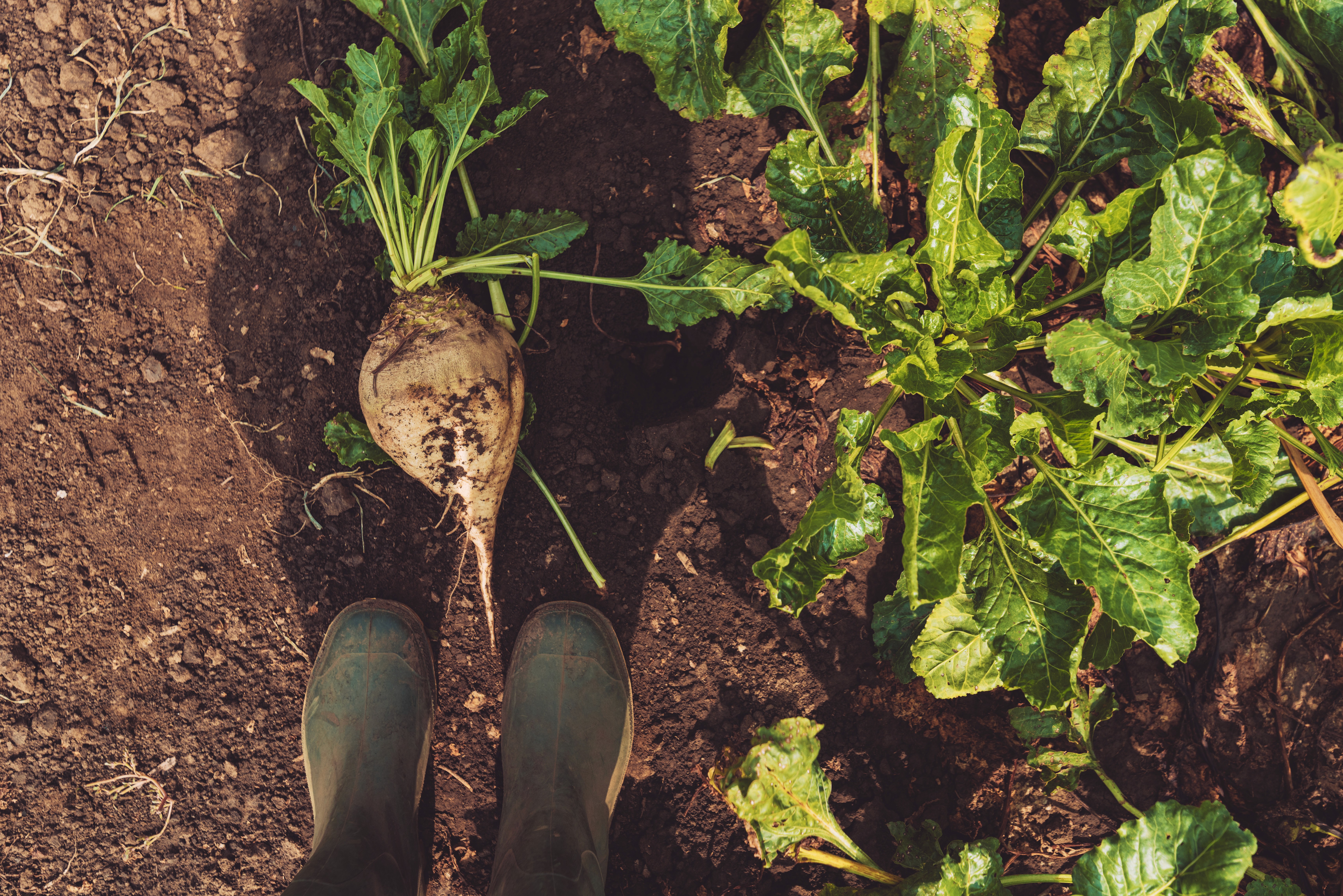
The produce comes from a real property in Tauranga. Customers can visit the orchard. The farm is certified organic. The owner teaches organics and continues to learn. The food changes with the seasons and goes directly to local households.
The opportunity was to stop selling "organic" as a claim and build the brand around something much more tangible:
knowing where your food comes from.


The Result
Back to the Source.
The creative direction came from the idea that food has become anonymous. By the time it reaches the supermarket, most of us have lost any connection to the land, season and people behind it.
This brand had the opposite story.
The source was real, visible and open.
That became the foundation of the identity. Agricultural information such as orchard maps, crop markers, variety names, dates and growing records became the visual language, translated into a contemporary system rather than the usual organic-farm aesthetic.
The identity uses tracing, mapping, labelling and documentation to create a visible connection between the food and where it came from. Photography focuses on the actual land, people and growing process, while packaging becomes a record of origin rather than simply a branded box.
The result is a brand that does not need to tell people it is authentic.
It can show them where it came from.