Forge Academy
A brand identity for a healing and life-building platform built around one belief: healing is not the destination. It is the foundation for becoming.
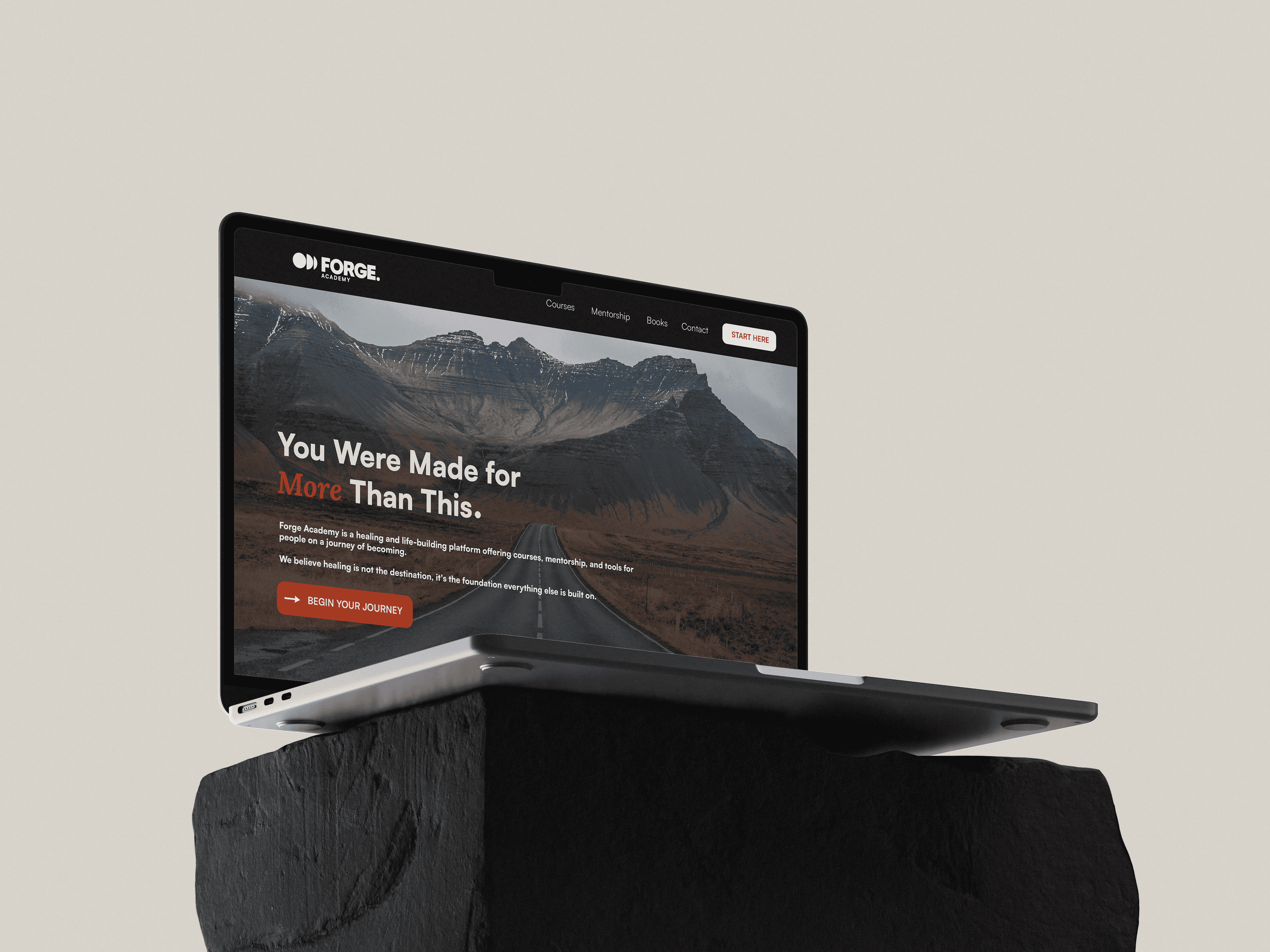
Services:
Brand Identity, Website Design, Logo Design, Copywriting
Industry:
Personal Development & Education
Timeline
6 Weeks
The Challenge
The personal development space is crowded with brands that look and sound the same. Soft colours, calm photography and endless language around healing and transformation.
Forge needed to take a different position. Healing is important, but it is not the end goal. The brand needed to speak to people who were ready to use what they had learned to build something more.



The Result
A forge is a place where something is deliberately worked, shaped and transformed. It is not passive. Something goes in, work happens, and something different comes out.
That led to the central idea behind the identity:
Becoming is a craft.
People are not finished products. They are shaped by what they learn, practise and choose to do.
And craftsmanship leaves evidence.
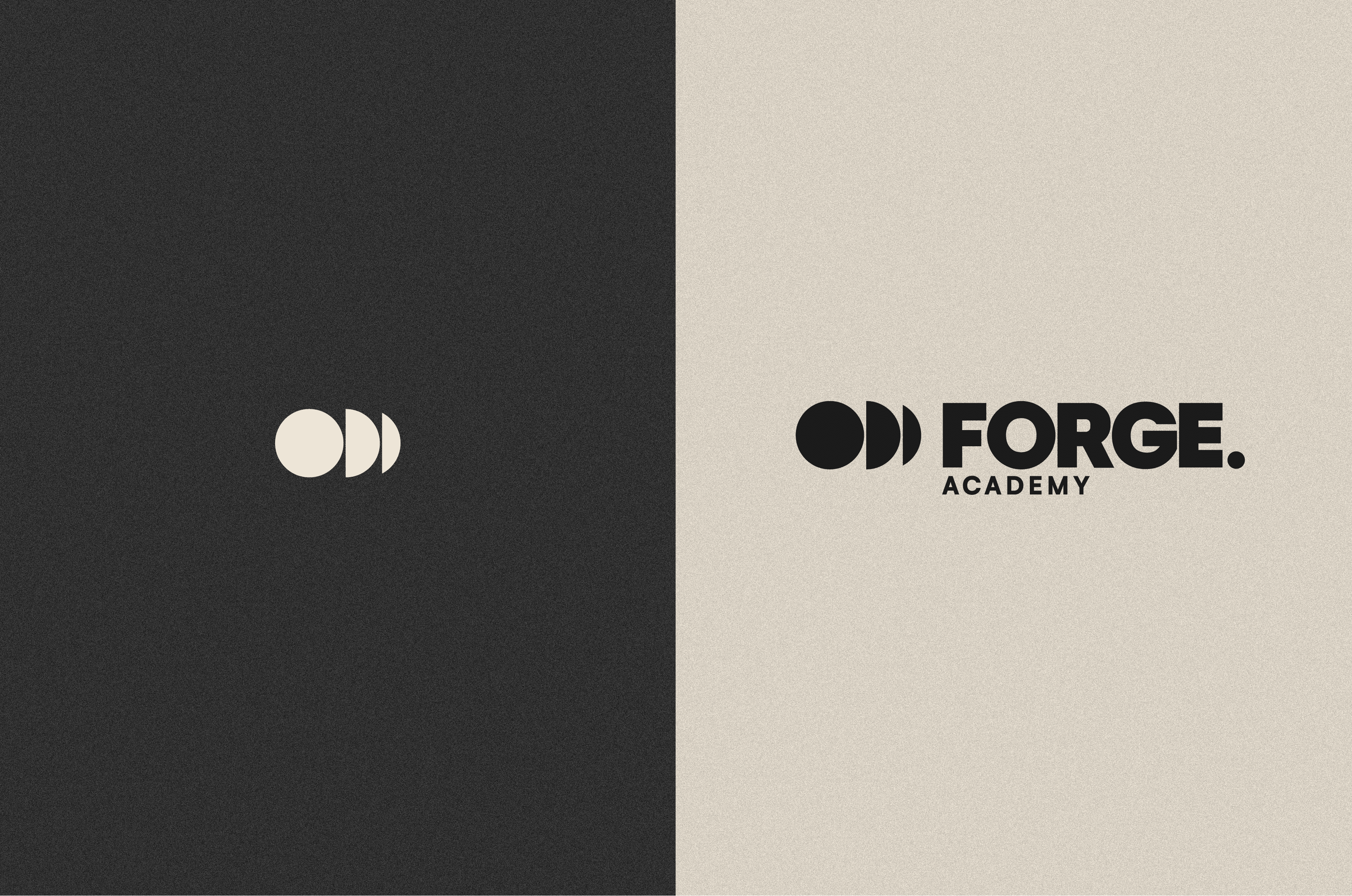
A maker's mark identifies the person responsible for something that has been made. It represents authorship, skill, effort and intention. That became the visual shorthand for Forge and the foundation for the entire identity.
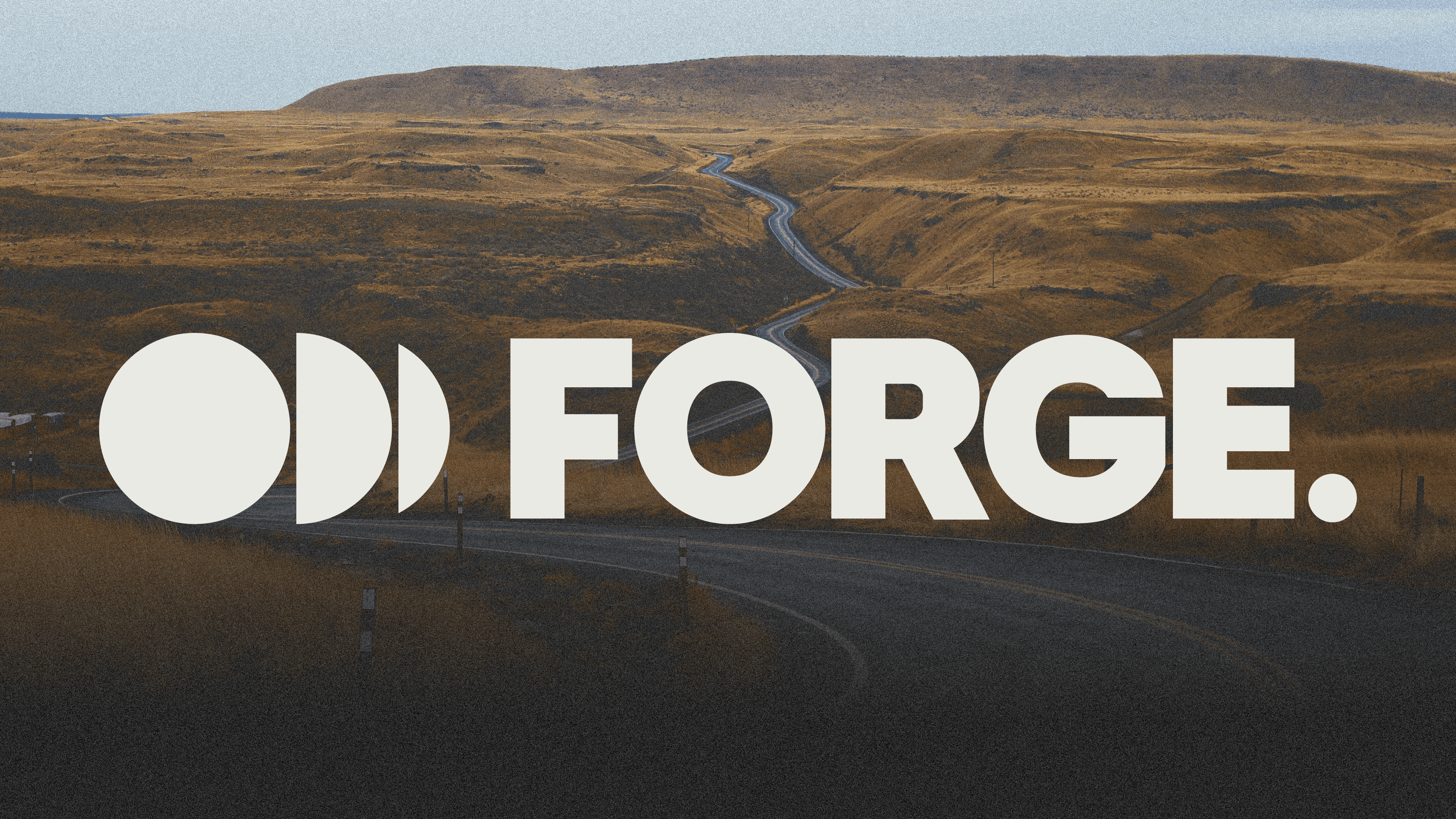
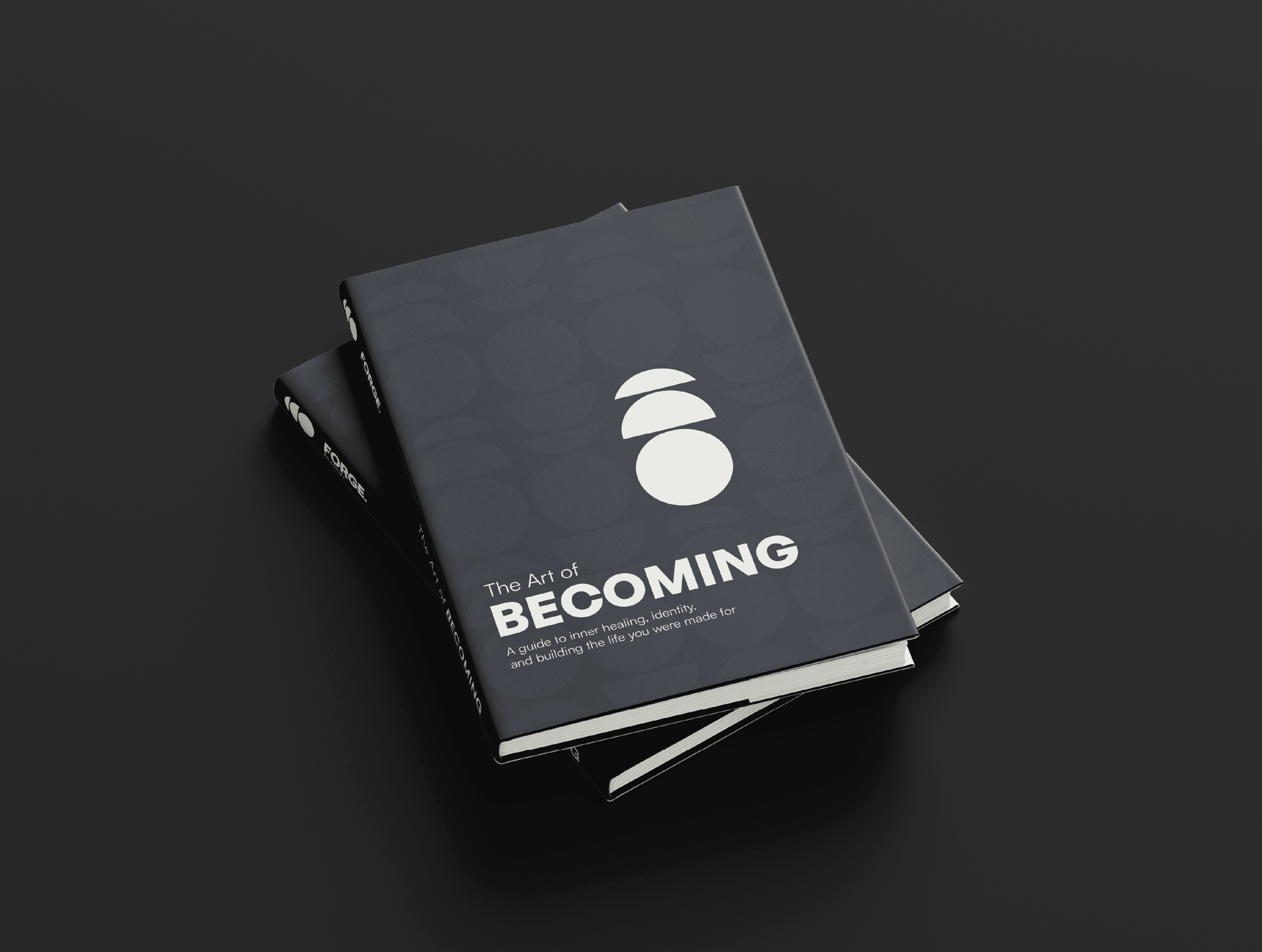
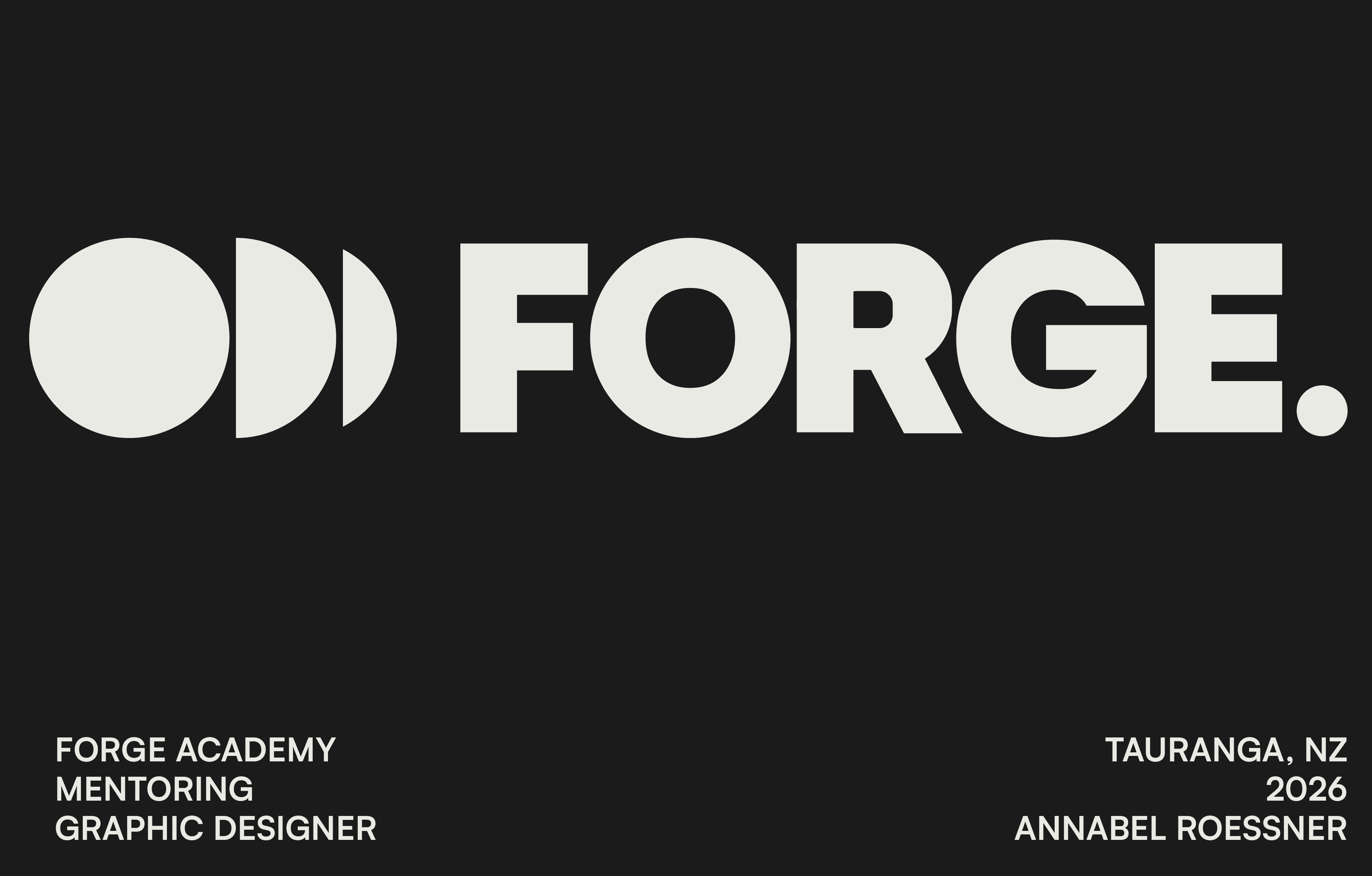
The Forge symbol is treated like a modern maker's mark, giving the brand a compact signature that can be stamped, repeated and recognised across the system.
From there, the idea of craftsmanship carries through everything else. Graphic elements reference stamps, impressions, proof marks and process notation. Typography can be marked, interrupted and altered, making the identity itself feel worked rather than perfectly polished.
The photography follows the same principle. Instead of presenting people as perfected versions of themselves who have already "made it", it focuses on people in the work: presence, concentration, movement and humanity.
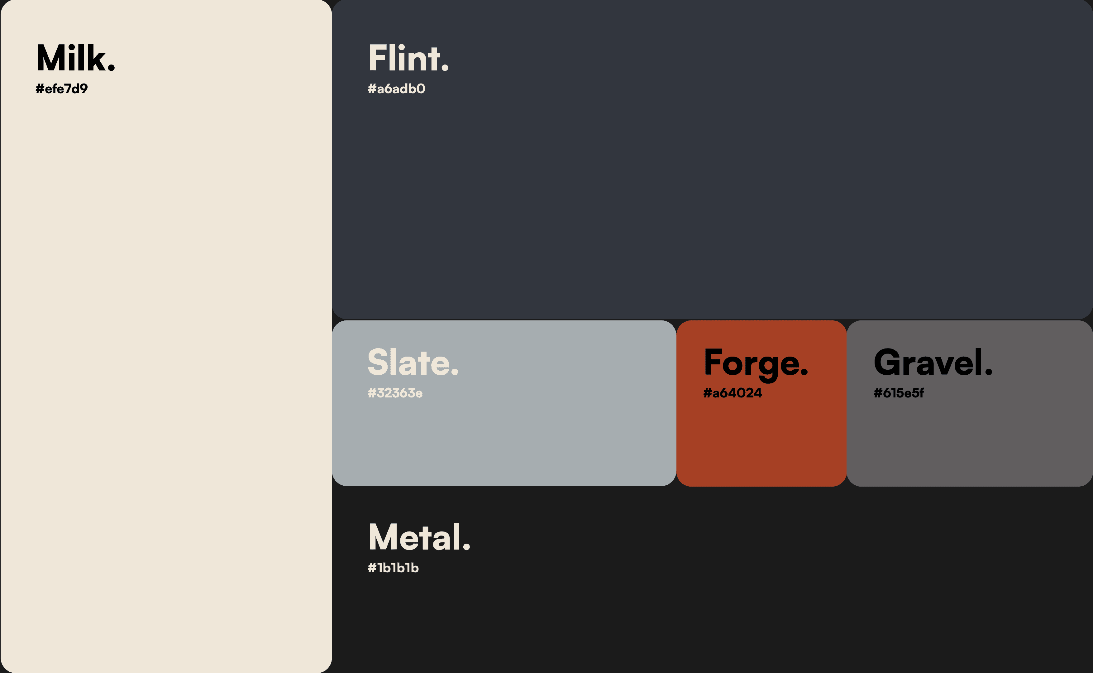
The colour palette deliberately moves away from the soft pastels and wellness greens expected in the category. Black, bone, oxide, steel and gold give the brand weight and warmth without pushing it into stereotypically masculine territory.
The result is an identity that doesn't feel like another wellness platform and more like a place where something is being built.
Forge does not ask people to identify with being broken or perpetually on a healing journey.
It gives them a more active identity:
You are capable of becoming.
Healing is the foundation.
The work is the process.
Becoming is the outcome.